Google Calendar
Ergonomic Evaluation and Redesign
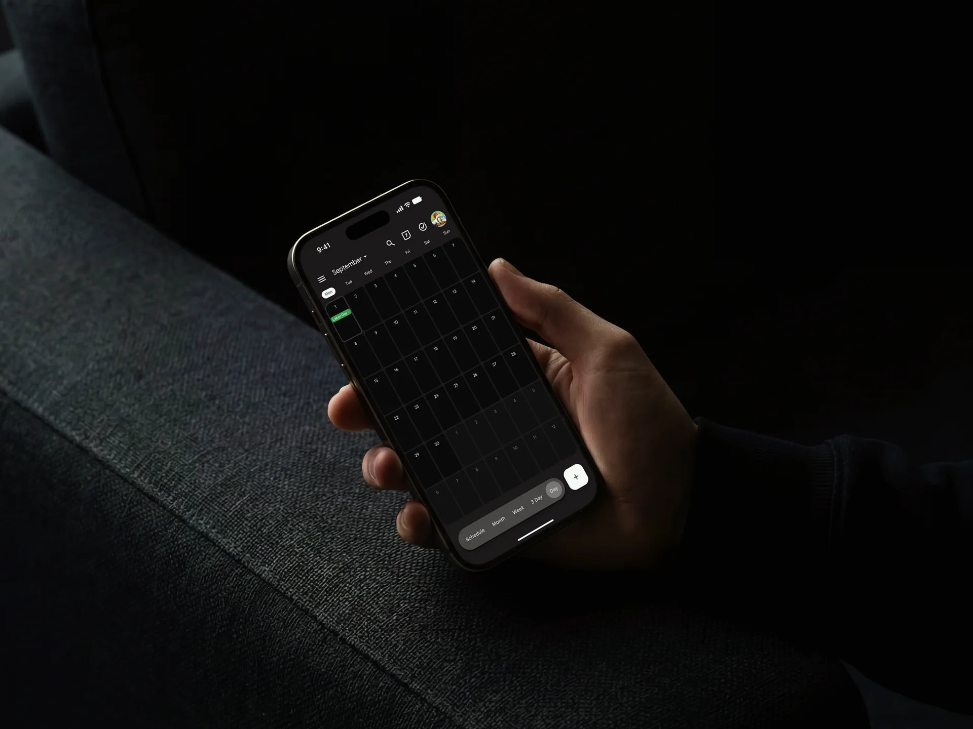
Calendar gives you a lot of control. Finding that control isn't always easy.
This was a 3-week course project where we explored how visual ergonomics could affect the everyday experience of using a digital product.
We chose Google Calendar because it already does almost everything a calendar needs to do. Instead of adding features, our goal was to find where the existing experience made simple scheduling tasks harder than they needed to be. The question was simple:
Can we make Calendar easier to perceive, understand, and act on without changing what it can do?
A role spanning research, design, and validation.
This was a 3-member team project, and my work covered the full journey from research to validation.
I worked on understanding the existing experience, identifying usability problems, translating those findings into interface and interaction changes, prototyping the redesign, and testing the result.
Research
Design
Validation
The first step was understanding where everyday scheduling became harder than it needed to be.
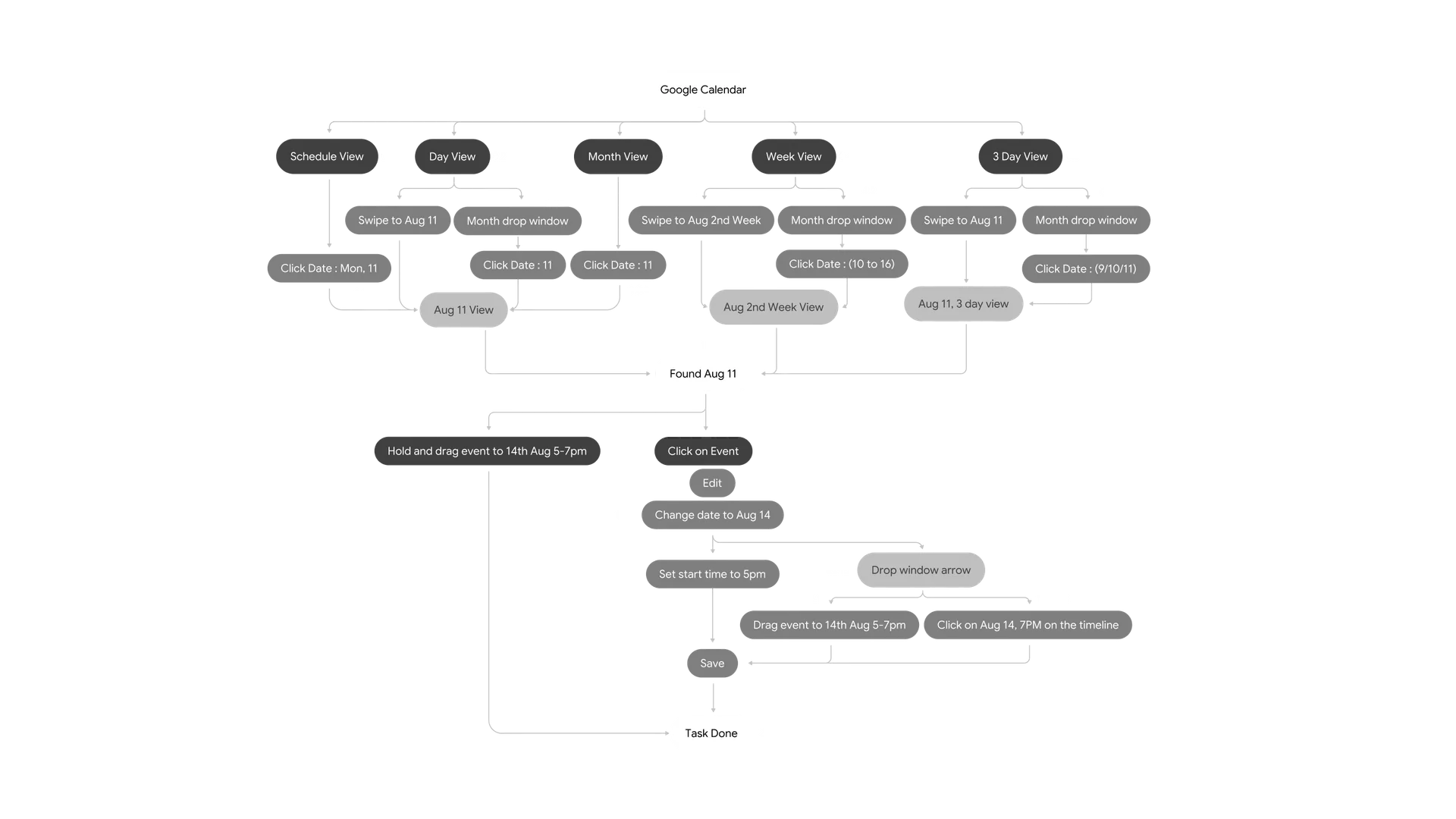
We started by picking a few things that people commonly do in Calendar; rescheduling an event, changing its duration, deleting an event, creating overlapping events, and setting up recurring events.
Instead of immediately designing something new, we broke those tasks down and looked at how people actually had to move through the interface to accomplish them. We also used user evaluation, heuristic evaluation and SHERPA to look at the interactions from different angles.
The problem wasn’t missing functionality. It was how that functionality was communicated.
Some actions were difficult to discover. Some important information competed with other things on the screen. Certain controls didn’t make their behaviour obvious. And when we looked at things like duration and recurrence, some of the terminology didn’t necessarily match how a person naturally thinks about scheduling. So instead of saying, “Let’s redesign Calendar,” we started asking much more specific questions: Can this action be easier to find? Can this information be understood faster? Can this interaction behave more like what the user expects?
That became the basis for the redesign.
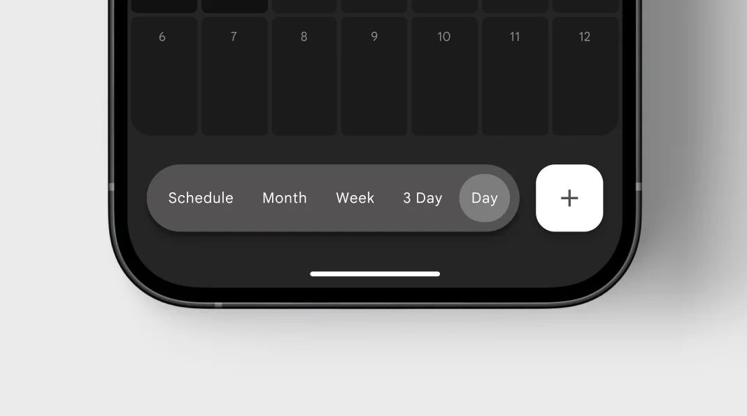
Frequently used views shouldn't be hidden behind navigation.
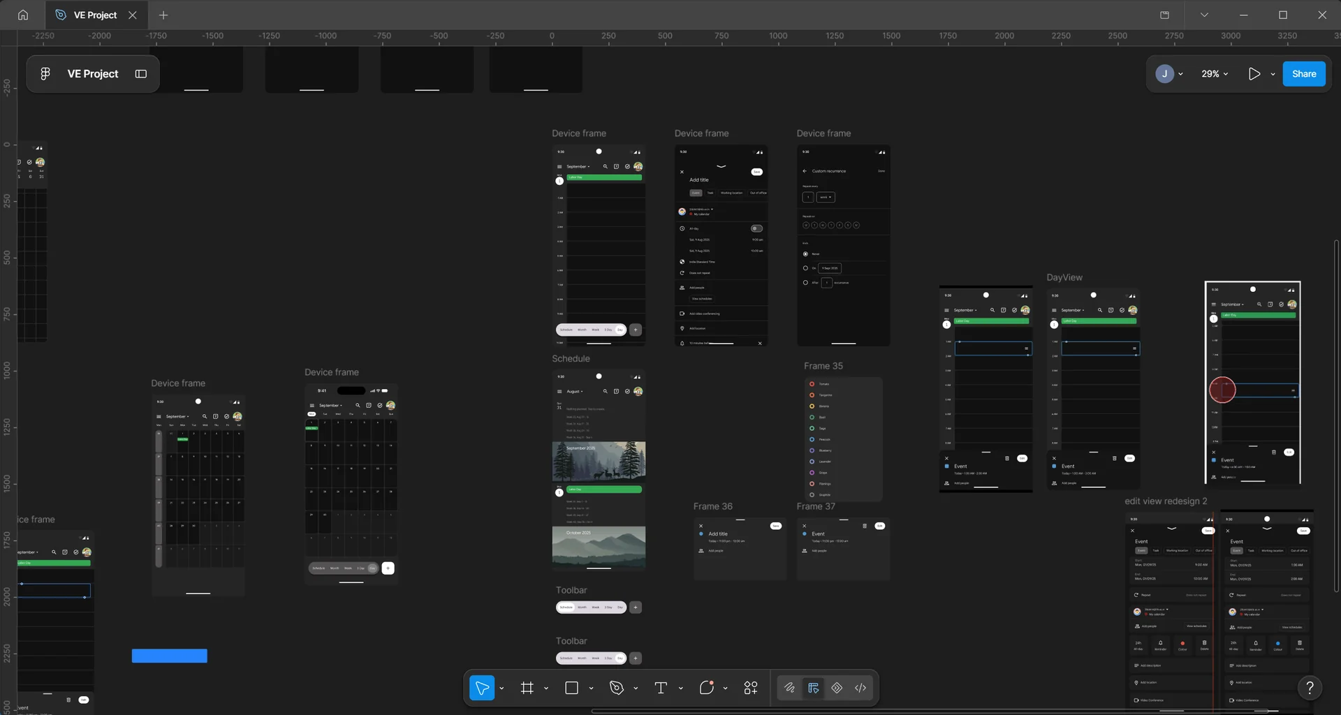
We brought the calendar view options into a persistent toolbar, making them easier to reach without digging through secondary navigation. Since these are actions users access frequently, keeping them closer to the main calendar reduces the effort of remembering where they live.
If an event has a physical place on the calendar, it should be easy to manipulate there.
We made event editing more direct by retaining drag-based duration changes and reorganising the editor around the information users need most. Because an event already has a visual position and duration, interacting with it directly makes the relationship between the action and its result easier to understand.
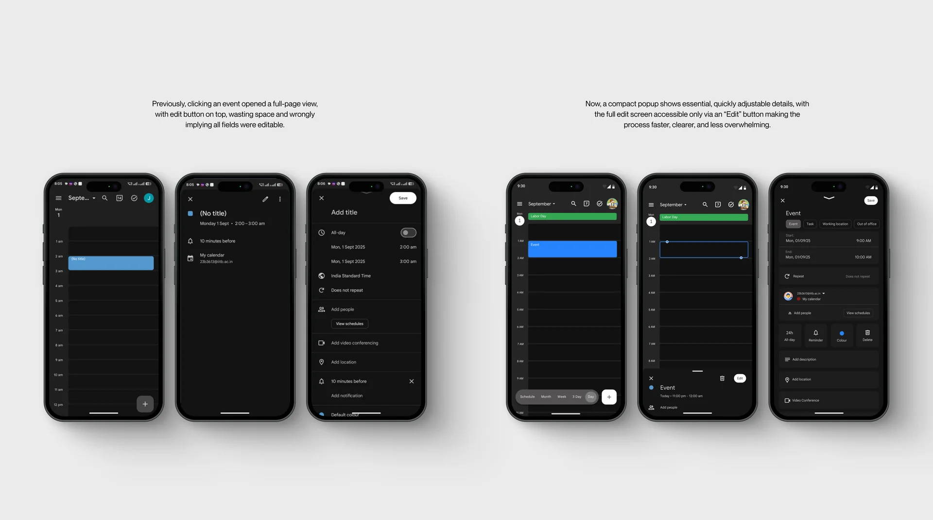
Original vs Redesign
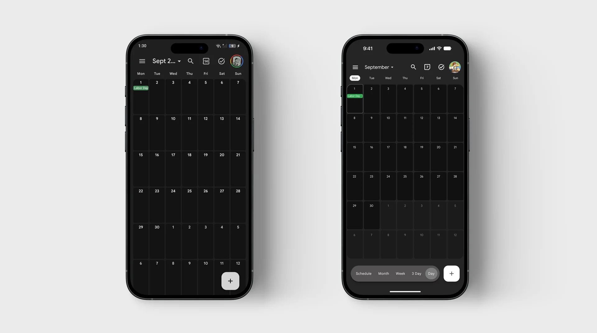
The current month should be obvious at a glance.
We reduced the visual weight of inactive months and gave the current month stronger emphasis. This creates a clearer starting point when looking at the calendar, helping users understand where they are in time without having to consciously search for it.
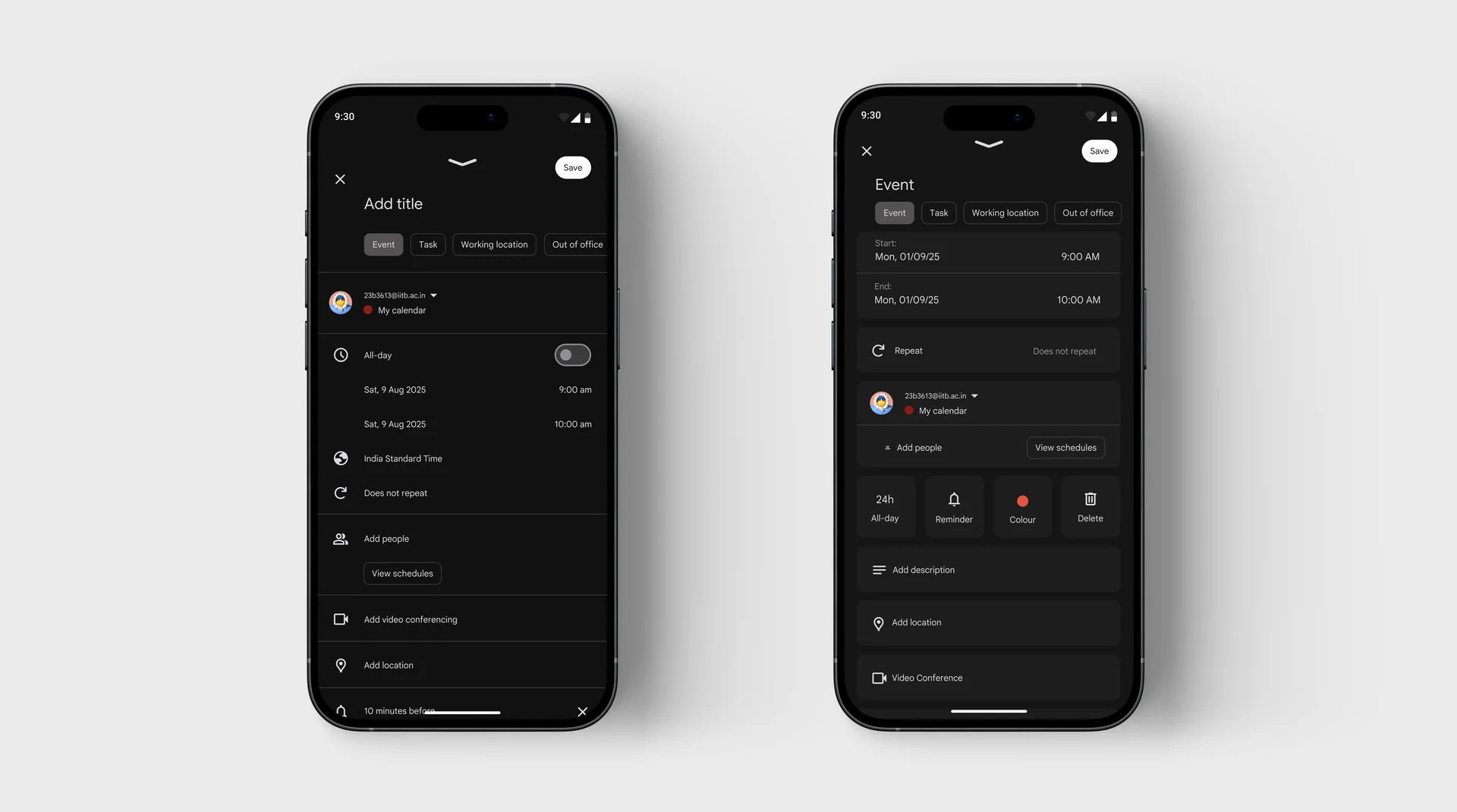
The event editor shouldn't make you hunt for basic information.
We reorganised the editor so important information and actions appear sooner, including a more prominent colour control, a clearer 24-hour control, and direct access to Delete. The idea was to reduce the amount of scrolling and menu-hunting needed for actions that are already part of everyday event management.
“Repeat” should describe what the user wants, not how the system works.
We surfaced common recurrence options and clarified how occurrences and end conditions were communicated. Instead of making users interpret system terminology, the controls now map more directly to how people naturally think about repeating an event; daily, weekly, monthly, or yearly.
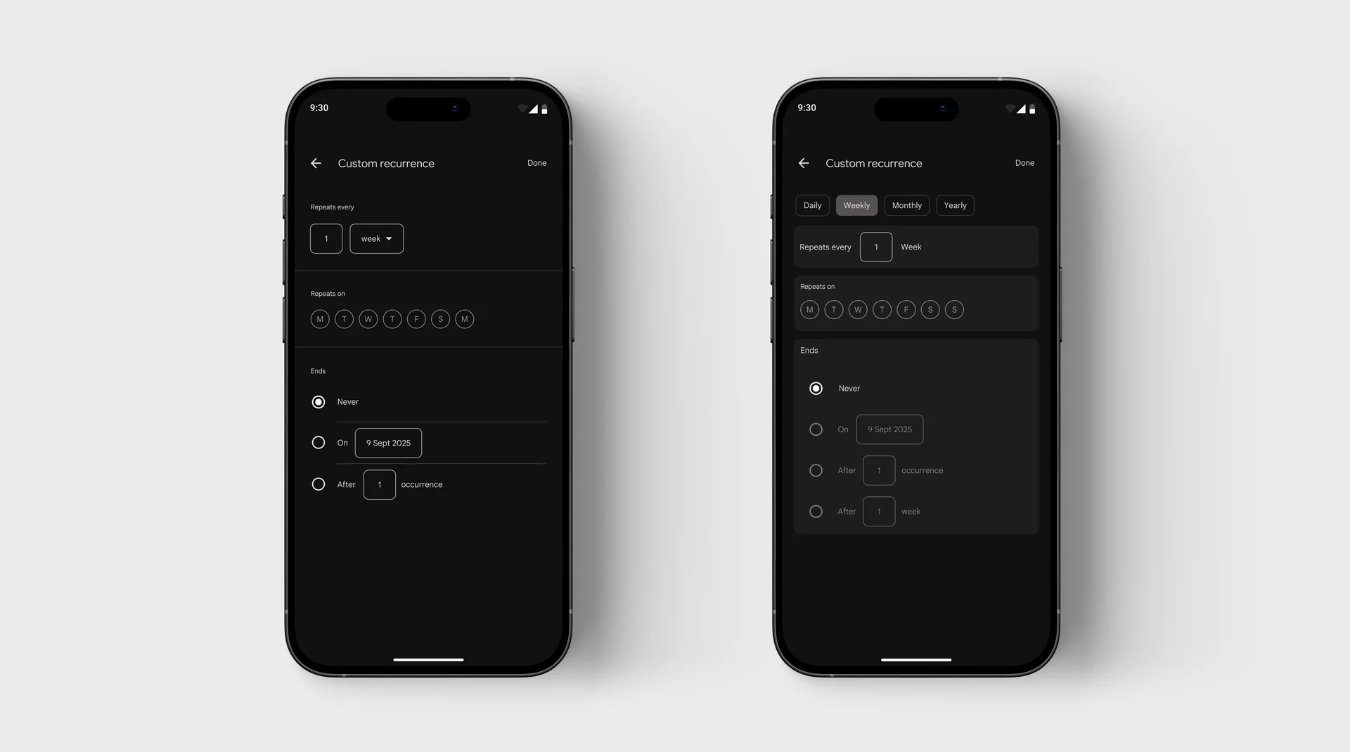
Original vs Redesign
The redesign looked better. But did it actually make things easier?
Then came the part that I think was most important to the project: we tested the redesign rather than assuming it was better.
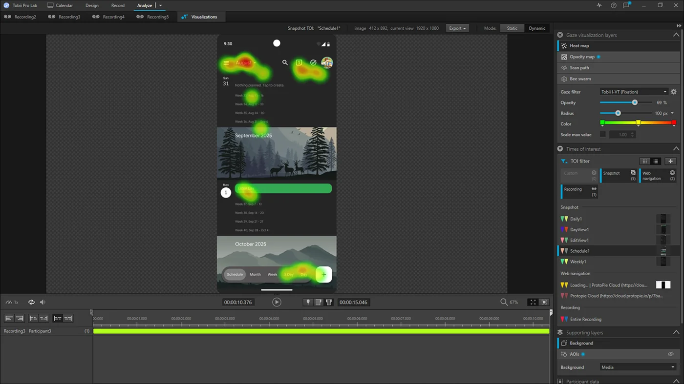
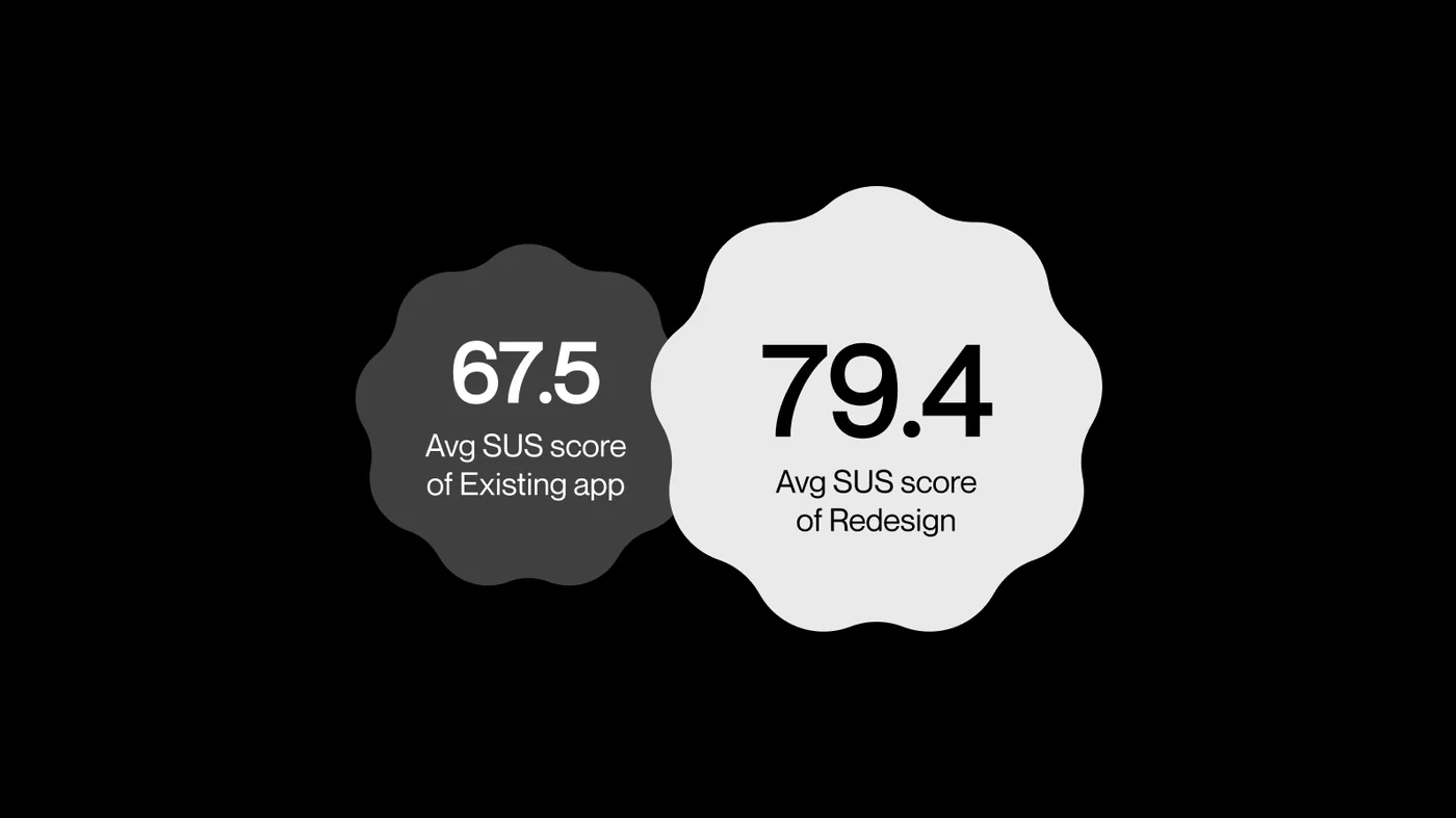
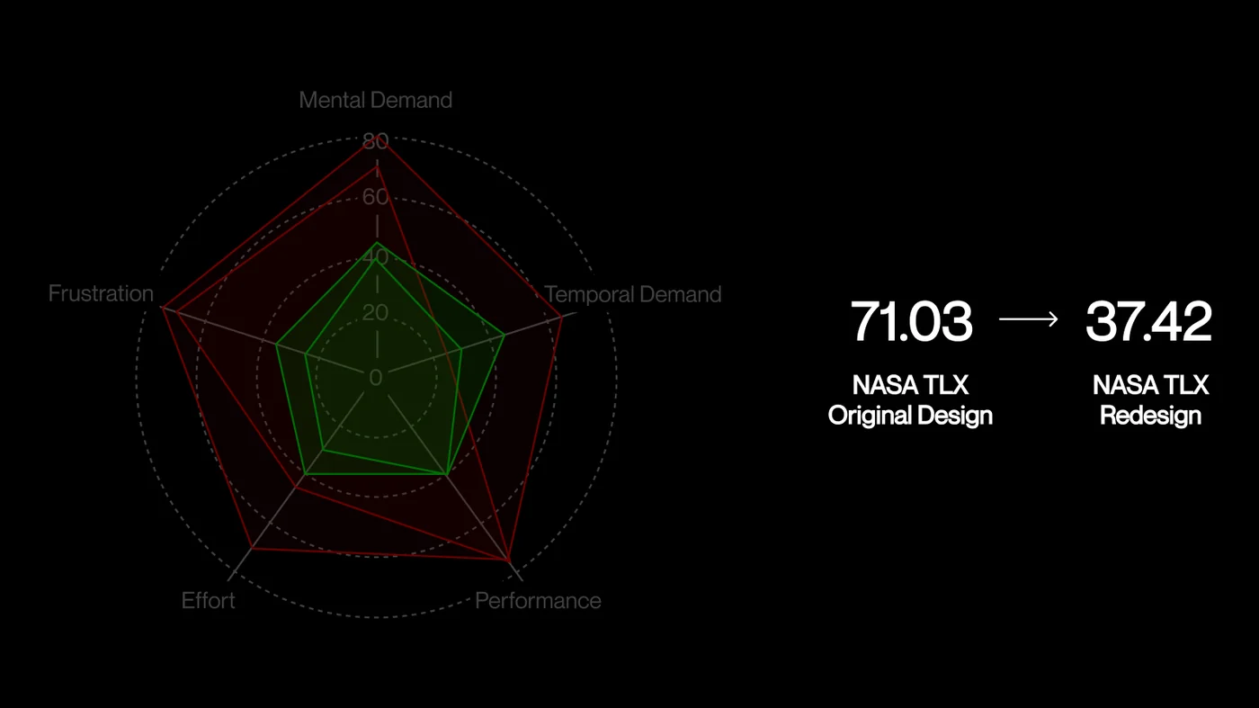
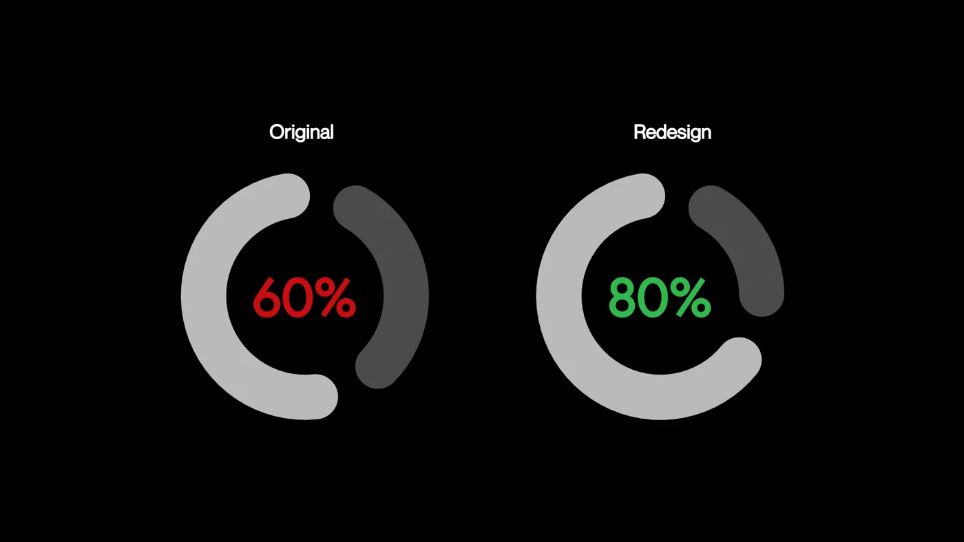
We compared the original and redesigned experiences using the same tasks. We looked at where people were looking, how they completed the tasks, how usable the experience felt, and how demanding the interactions were.
And the interesting thing was that the different forms of evaluation were pointing in the same direction.
The redesign wasn’t just visually cleaner. People had less figuring-out to do.
They spent less time searching for the right action, the hierarchy made important information easier to pick out, and the interaction itself was more predictable.
SUS
NASA TLX
Effectiveness
The biggest lesson was to question the interface before changing it.
It’s easy to look at an interface and immediately see things that could be made cleaner or simpler. This project taught me to pause and ask why the friction exists in the first place. A feature doesn’t necessarily need to change because it feels difficult. Sometimes the problem is simply that the interface isn’t communicating it clearly enough. That changed how I approach redesigns: start with the user’s struggle, find the reason behind it, and let the evidence shape the solution.
Good interface design isn’t just about making things easier to use. It’s about making the right things easier to perceive, understand, and act on.